Your favourite Adobe apps are getting a makeover – here’s what to expect
Say goodbye to boring grey - and hello to a brighter, more approachable palette as Adobe introduce Spectrum 2.
Published on 14th December 2023
Adobe has a vast suite of creative tools — and if you’ve ever used more than one, you’ve probably noticed they all have the same signature feel. Now, that look or design system, known as Spectrum, is getting a significant makeover with the introduction of Adobe Spectrum 2.
On Tuesday, Adobe unveiled Spectrum 2, the company’s most significant design system update, which covers every design element, including iconography, typography, color, brand, illustration, and more, according to the release.
The objective of the redesign is to keep up with Adobe’s evolving audience. Adobe Spectrum was introduced over a decade ago. At the time, the target audience was business professionals and the design was meant to have a more “serious” feel.
Today, Adobe’s Creative Cloud reaches a broader audience, from children to creators to business professionals. As a result, the design upgrade is designed to make the platform feel more approachable and expressive, inclusive and accessible, and “at home” on any platform.
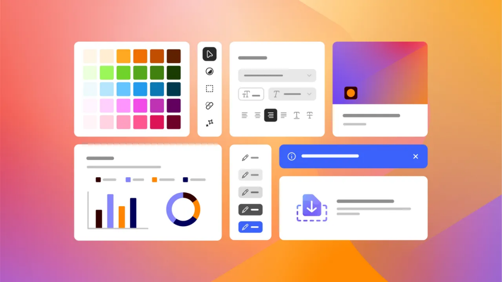
Adobe’s signature subdued gray color palette will soon be a thing of the past, replaced with a more welcoming, bold, and approachable design.
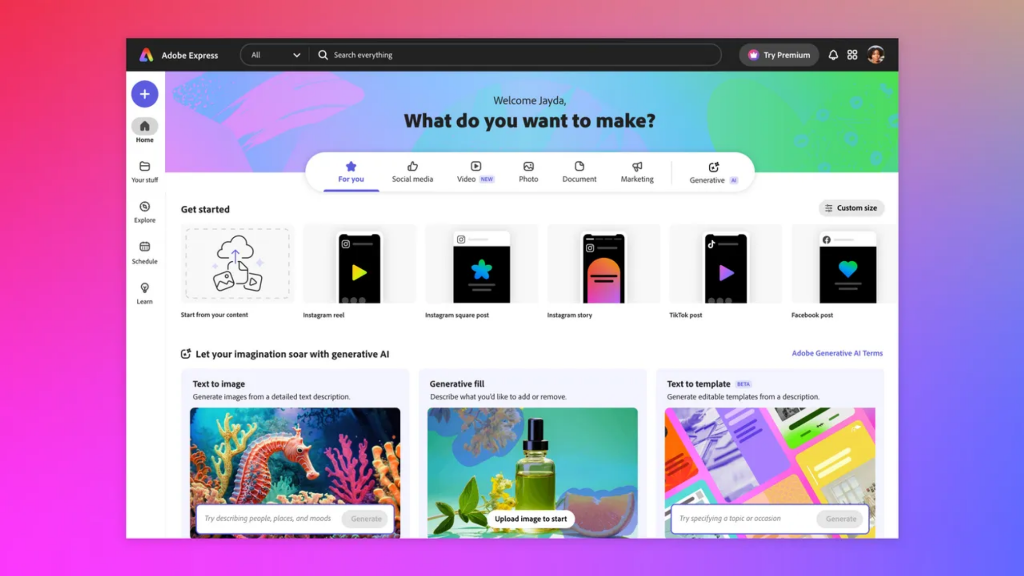
The Spectrum 2 team began previewing key components of the redesign on Adobe Express, which was made to look lighter, bolder, and rounder, and have brighter colors, thicker strokes, and more friendly icons and typography. These kinds of design changes will soon be seen across Adobe’s range as part of Spectrum 2.
To make its tools more accessible for visually impaired users, Adobe has added dynamic contrast and brightness, more accessible colors that support various color vision deficiencies, and an attention hierarchy to prioritize specific visual elements.
To achieve its more “at home” goal, Spectrum 2’s appearance is being made to vary between platforms, such as OSX, Windows, iOS, Android, and the web.
The goal with Spectrum 2 is for an Adobe tool to feel “at home” on the platform and device it is being used on, varying slightly per medium.
For example, the experience of Adobe Lightroom on your Android phone will be different to the experience on your MacBook. However, both versions will still retain the same Lightroom feel.
Spectrum 2 won’t begin rolling out until 2024, starting with Adobe web products.